Mobile commerce optimization means making every step from ad click to repeat order work on a phone, then judging each change by profit, not by conversion rate alone. The fastest path is to split your mobile funnel, find the stage that leaks the most, fix that stage first (usually speed or checkout), and tie the result back to CAC, MER and LTV. Rozee Digital builds this work around one framework that covers acquisition, conversion and retention together, because a mobile fix that lifts conversion but ignores margin or repeat purchase only moves the problem.
TL;DR
- Phones now carry most orders: Statista data cited by Shopify puts 68% of online orders on smartphones as of Q1 2025, so a weak mobile experience taxes every ad dollar.
- Diagnose before you redesign. Split mobile sessions into product view, add to cart, checkout start and order, then fix the biggest drop.
- Speed and checkout friction are the usual culprits. Fewer fields, express wallets and fast pages come before cosmetic changes.
- Judge wins by contribution margin, CAC payback and LTV, not by conversion rate in isolation.
- Mobile optimization also feeds retention: a smooth first order makes the second one more likely.
Table of Contents
- What mobile commerce optimization actually covers
- The metrics that decide whether a change is worth making
- Step 1: Benchmark mobile against desktop, then diagnose
- Step 2: Fix speed first
- Step 3: Make discovery and product pages thumb-friendly
- Step 4: Rebuild checkout for touch
- Step 5: Test one change at a time, and judge it on profit
- Step 6: Connect mobile experience to retention and LTV
- Where mobile optimization goes wrong
- Our perspective
- Work with Rozee Digital on mobile conversion and retention
- FAQ
- Sources
What mobile commerce optimization actually covers
Mobile commerce is buying and selling on smartphones and tablets, and Salesforce describes it as shaped by mobile traits such as saved payment methods, biometric authentication and digital wallets. Optimizing it means designing for how people really shop on a phone: one thumb, a small screen, a patchy connection and constant interruptions.
For an established brand, that breaks into five layers:
- Performance: how fast pages load and respond.
- Discovery: navigation, search and collection pages.
- Product pages: images, copy, reviews and the add-to-cart button.
- Checkout: form fields, payment options and trust signals.
- Retention: post-purchase email, SMS and the return visit.
Most advice lists tactics across all five. The more useful question for a brand spending real money on paid media is which layer is costing you the most, which is what the next sections help you answer.
The metrics that decide whether a change is worth making
Before touching the site, agree on the numbers. Four terms come up constantly:
- Conversion rate (CVR): orders divided by sessions, times 100. Measure mobile on its own, with a consistent date range and device definition.
- CAC (customer acquisition cost): total acquisition spend divided by new customers won.
- ROAS (return on ad spend): revenue attributed to ads divided by ad spend. It says nothing about margin or about what organic and email contributed.
- MER (marketing efficiency ratio): total revenue divided by total marketing spend across all channels. It is harder to game than platform ROAS and shows whether the business, not just the ad account, is getting healthier.
- LTV (lifetime value): the gross profit a customer generates over their relationship with you. It sets how much CAC you can afford.
Mobile optimization improves all of them at once when it works: a higher CVR lowers CAC on the same traffic, a better checkout lifts MER, and a better post-purchase experience raises LTV. That is why we treat it as a profit lever rather than a design project. Our guide to ecommerce conversion optimization covers the wider method.
Step 1: Benchmark mobile against desktop, then diagnose
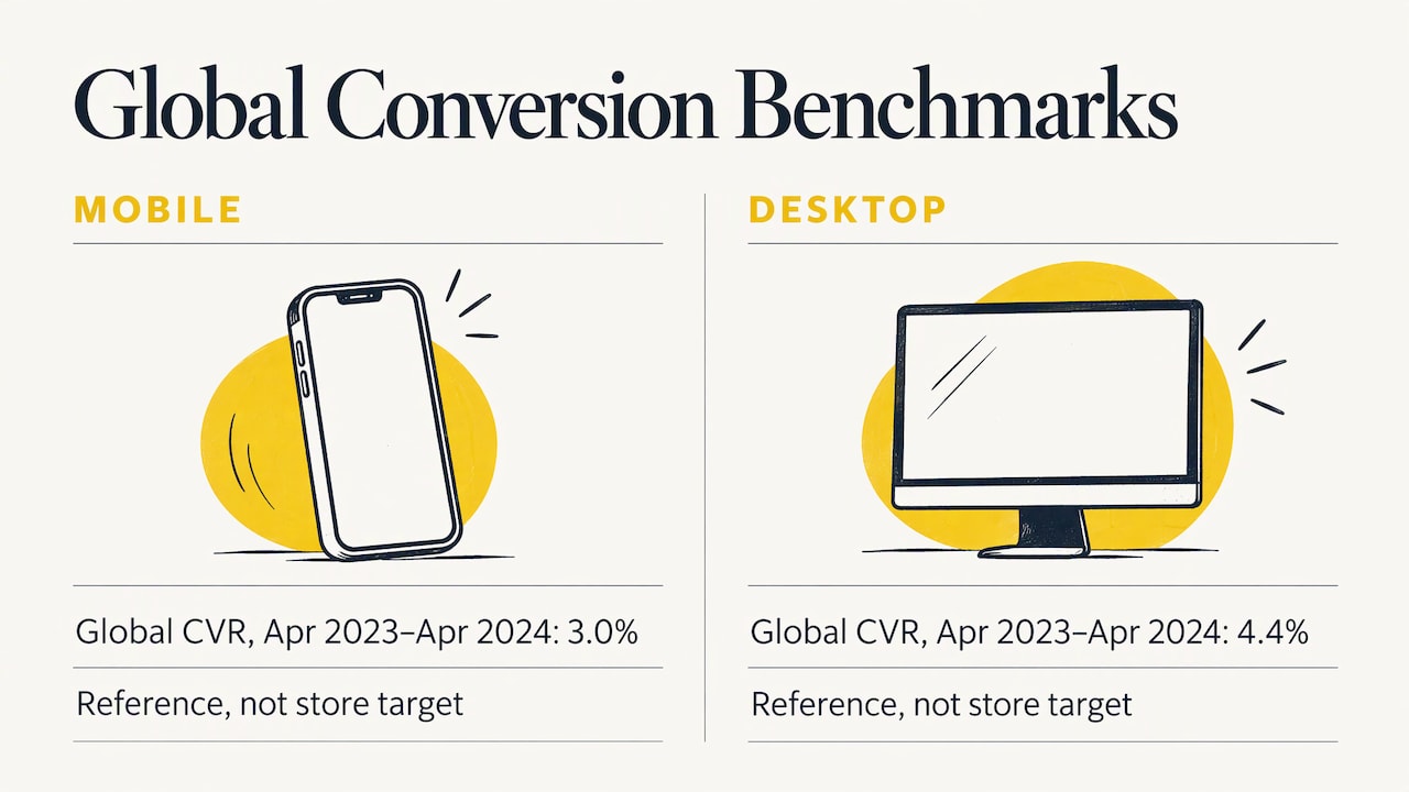
Pull mobile-only data from your analytics platform and compare it with desktop. As a reference point, a figure cited by Shopify’s enterprise team puts the global mobile conversion rate between April 2023 and April 2024 at roughly 3.0%, against 4.4% on desktop. Your own category and price point will differ, so use that gap as a direction rather than a target. Shopify’s mobile CRO guidance suggests tracking mobile-only traffic, landing-page performance, funnel drop-offs and device usage to assess the experience.
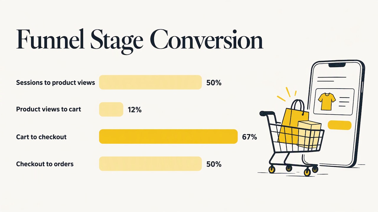
A single conversion rate cannot tell you where the problem sits. Break the funnel into stages.
A worked example (hypothetical)
This example is illustrative only and does not describe any real brand or client.
Say a DTC brand gets 60,000 mobile sessions a month and 1,200 orders: a 2.0% mobile conversion rate. The funnel looks like this:
| Stage | Sessions or users | Share of previous stage |
|---|---|---|
| Mobile sessions | 60,000 | n/a |
| Product page views | 30,000 | 50% |
| Add to cart | 3,600 | 12% |
| Checkout started | 2,400 | 67% |
| Orders | 1,200 | 50% |
Half of the shoppers who start checkout leave. That is the stage to fix first, because moving it from 50% to 60% adds 240 orders from traffic you have already paid for, with no extra ad spend. If the same brand fixed a weaker add-to-cart rate instead, it would be working on a stage where the cause is far less obvious.
When the gap with desktop is large, Solidgate’s checkout guide notes it usually points to mobile-specific constraints such as layout, load time or too many form fields. That gives you a short list of suspects before you spend on a redesign.
Step 2: Fix speed first
Speed is the cheapest conversion lever to underestimate. Google Ads Help states that nearly half of visitors leave a mobile site if pages do not load within 3 seconds, and recommends minimizing load time so people can move through quickly.
The size of the prize is documented. A Deloitte study of 37 brands found that a 0.1-second improvement in mobile site speed correlated with an 8.4% increase in retail conversions. This is a correlation across a sample, not a promise for your store, but it explains why speed work often pays back faster than a new theme.
Practical priorities for a Shopify, WooCommerce or Magento store:
- Audit third-party scripts. Review apps, tags and pixels, and remove those no one uses. Each one adds weight on a phone.
- Compress and size images properly. Product galleries are usually the heaviest element.
- Minimize redirects. PayPal’s mobile checkout guidance recommends compressed images and fewer redirects.
- Check real-user data, not just lab scores. Core Web Vitals (Google’s measures of loading, responsiveness and layout stability) tell you whether pages feel fast to actual shoppers.
Speed also has a paid media angle. Slow landing pages waste clicks you have already paid for, which pushes up CAC. Our piece on mobile optimization for ecommerce PPC explains how that plays out in ad performance.
Step 3: Make discovery and product pages thumb-friendly
On a phone, shoppers decide quickly whether to keep scrolling. The adjustments that matter most:
- Short, simple menus. Google Ads Help recommends simplifying menus and keeping information visible without zooming.
- Prominent calls to action. The same page advises placing the purchase button prominently and using expandable product images.
- Search that forgives. Put site search near the top, with autocomplete and spelling correction, and filters that never leave a shopper at a zero-result page, as Google’s mobile-site research recommends.
- No obstructing promotions. Pop-ups and banners should not cover navigation or content.
One point that reaches beyond design: mobile shoppers often browse on a phone and buy later on a laptop. Google’s guidance includes letting shoppers resume a cart on desktop, which protects revenue you would otherwise lose between devices. It is also a reminder that mobile conversion rate alone understates what mobile traffic contributes, so read it alongside cross-device and assisted revenue.
If your store design needs a broader rethink, our guide to ecommerce website design for scale and ROI goes deeper. Search visibility is part of the same picture, and this overview of mobile optimization and ecommerce SEO shows how mobile experience ties into organic traffic.
Step 4: Rebuild checkout for touch
Checkout is where mobile revenue is won or lost, and the most common cause is treating the phone as a shrunken desktop. Stripe’s guidance holds that mobile checkout must be engineered for touch input, small screens, interruptions and minimal typing, not simply resized.
An optimized mobile checkout typically includes, per the same source:
- a single-column layout with large tappable buttons and fields
- minimal, logically ordered fields
- autofill and real-time validation
- a progress indicator
- saved-payment or express-checkout options
Wallets and fewer fields
Shopify’s mobile CRO guide recommends offering Google Pay, Apple Pay or Shop Pay, saving payment details and collecting only essential information. Solidgate’s checkout benchmark sets a target of 8 form fields, a useful ceiling for an audit of your current form.
There is modeled evidence for the payoff. In a Forrester Total Economic Impact study of PayPal Checkout, the composite organization’s cart conversion rate rose from 30% to 45%. That is a model built from interviews, not a forecast for your store, but it shows how large the effect of reducing payment effort can be.
Trust still matters on a small screen
PayPal recommends visible security indicators, PCI compliance and secure payment gateways for mobile checkout. PCI compliance is the payment card industry’s security standard, and it is a baseline for any brand taking cards, not an optional extra.
Watch the abandonment number, then the margin
By Q3 2024, Solidgate reports mobile cart abandonment reached 85%, six points above desktop. Treat that as context for why checkout deserves priority. Then protect profit: if you add a discount to rescue abandoned carts, track the effect on margin and repeat rate, not just on orders.
Step 5: Test one change at a time, and judge it on profit
Mobile traffic can be noisy, so structure your testing:
- Pick the stage with the biggest loss from your funnel table.
- Write a hypothesis tied to evidence, such as “checkout abandonment is high because the form has 14 fields.”
- Change one thing, or one tightly related set of things, and run the test long enough to cover full weekly cycles.
- Measure beyond conversion rate: average order value, contribution margin after discounts and shipping, and refund rate.
- Roll out, then re-benchmark and move to the next-biggest leak.
A test that lifts conversion by 8% but works only through a deep discount can lower profit per order. That is why we pair conversion tests with margin tracking. Our CRO strategies guide and the piece on Shopify conversion strategies lay out test ideas in more detail.
Step 6: Connect mobile experience to retention and LTV
A first order that goes smoothly sets up the second. Express checkout and saved details mean a returning customer can buy again in seconds, which is the mobile shopping behavior Salesforce highlights: faster transactions through saved payment methods and wallets. In the Forrester model of PayPal Checkout, the composite organization also saw a 20% customer-retention uplift over three years.
To turn a good mobile experience into LTV:
- Capture consent at the right moment. Offer email or SMS sign-up after purchase or at a natural point in browsing, never in a pop-up that blocks the page.
- Design emails and SMS for the phone, since that is where most of them will be opened.
- Make the reorder path short. Link straight to the product page with the item ready to add.
- Segment by behavior, such as first-time buyers, repeat buyers and lapsed customers.
We set up and optimize this layer through our email and Klaviyo services, so that the acquisition spend on mobile builds a customer base rather than a one-time order.
Where mobile optimization goes wrong
- Chasing a benchmark instead of a diagnosis. A published average tells you nothing about which stage of your own funnel is broken.
- Redesigning before measuring. A new theme can hide a slow script or a long form that is the real cause.
- Optimizing the site and ignoring the ad. If the ad promises one thing and the mobile landing page shows another, conversion suffers upstream of any checkout fix.
- Declaring victory on conversion rate. Check that margin, AOV and refunds held steady.
- Treating it as a one-off project. Devices, wallets and platform rules change, so benchmark again on a regular schedule.
Our perspective
Most brands come to us after spending months improving traffic while the mobile experience quietly wastes it. Paid media, conversion and retention are one system, and treating them as separate jobs is how teams end up with a good ROAS and a shrinking margin.
That is why our Ecommerce Acceleration System™ looks at acquisition, conversion and retention together, and why our work is led by senior strategists rather than junior staff. We keep our client roster deliberately small so that the people who diagnose your mobile funnel are the people who stay with your account.
Our view is simple: find the stage that leaks, fix it, and prove the result in profit. Mobile is where most of your customers meet you, so it deserves that discipline.
Tom
Work with Rozee Digital on mobile conversion and retention
If you run an established Shopify, WooCommerce or Magento brand and want mobile traffic to convert at a profit, Rozee Digital can help. We manage paid media across Google, Meta, Pinterest and TikTok, create static and video ad creative, build conversion-focused landing pages, and run email and SMS for lifetime value, all within one framework.

To see the full range of services, visit Rozee Digital. If your main concern is the cost of traffic that lands on mobile, our paid social campaign management and paid search services pages explain how we approach it.
FAQ
What is an example of mobile optimization?
Offering express checkout is a clear one. With Shop Pay, as Shopify describes, logged-in shoppers check out with pre-saved details instead of typing everything again. Other examples include compressed images, a single-column checkout and short menus.
How do I calculate my mobile conversion rate?
Divide mobile orders by mobile sessions and multiply by 100. For example, 960 orders from 48,000 sessions is 2.0%. Keep the date range and device definition the same each time you measure, so you compare like with like.
Why is my mobile conversion rate lower than desktop?
A gap is common, since phones involve smaller screens, more typing friction and more interruptions. It usually points to slow pages, a cluttered layout or a long checkout form. Splitting the funnel by stage shows which one applies to your store.
Does page speed really affect revenue?
Yes, according to published research. Google Ads Help says nearly half of mobile visitors leave if a page takes more than 3 seconds, and the Deloitte study linked a 0.1-second speed gain to an 8.4% rise in retail conversions. Your results will depend on your starting point and traffic mix.
Sources
- Optimize your website for mobile, Google Ads Help
- Milliseconds Make Millions, Deloitte
- The Total Economic Impact of PayPal Checkout, Forrester
- Mobile checkout best practices for ecommerce, Stripe
- Optimizing Checkout for Mobile, PayPal
- 7 Proven Ways to Get Faster Checkouts, Shopify
- CRO for Mobile, Shopify
- Mobile Optimization, Shopify
- What Is Mobile Commerce?, Salesforce
- Checkout optimization guide, Solidgate
- Principles of Mobile Site Design, Think with Google